CRF Event Creative Strategy
Created a presentation to define brand positioning and propose initial creative solutions for a high-end, invite-only event.
❋ Project OverviewTimeline: April 2026 – June 2026
Works Done: Research and Ideation, Image Sourcing, Moodboarding, Creative Strategy and Direction, Preliminary Brand Presentation
Tools: Illustrator, InDesign, Adobe Stock, iStock, Pexels, Pinterest
Disclaimer: This project features preview stock images from Adobe Stock and iStock and images posted to Google and Pinterest that were used only to create moodboards. All rights to the original content are held by their respective copyright owners.
❋ Tentative event name is redacted at this time.
Creative Brief and Goals
Different than the physician-focused conferences hosted by the Cardiovascular Research Foundation, this event is an exclusive summit for industry leaders and partners. As opposed to a traditional conference experience, this event is positioned as an industry retreat meant to promote clarity and spark innovation in a sophisticated, yet relaxed setting.
Brands Vibes From Creative Brief
❋ Calm, healthy, balanced, in-nature
❋ Clarity, openness
❋ Communication, forward-thinking
❋ Effortless, confident
❋ Private, quiet, peaceful
❋ Exclusive, sophisticated luxury
❋ Retreat-style experience

Creative Direction
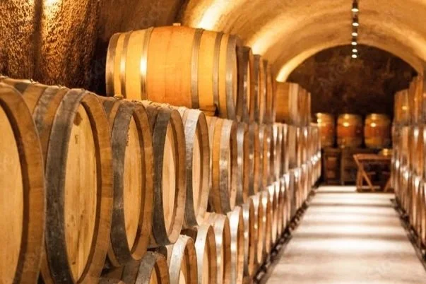
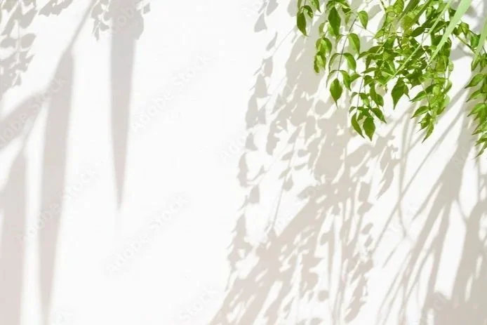
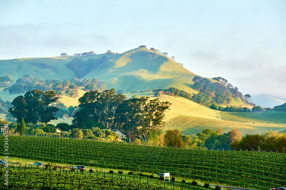
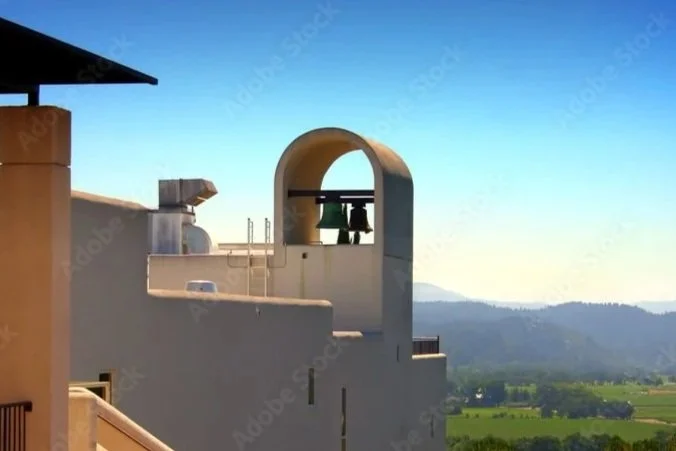
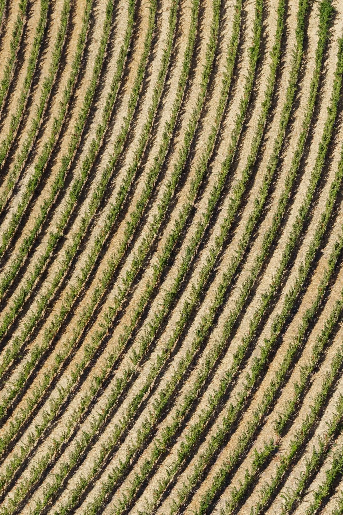
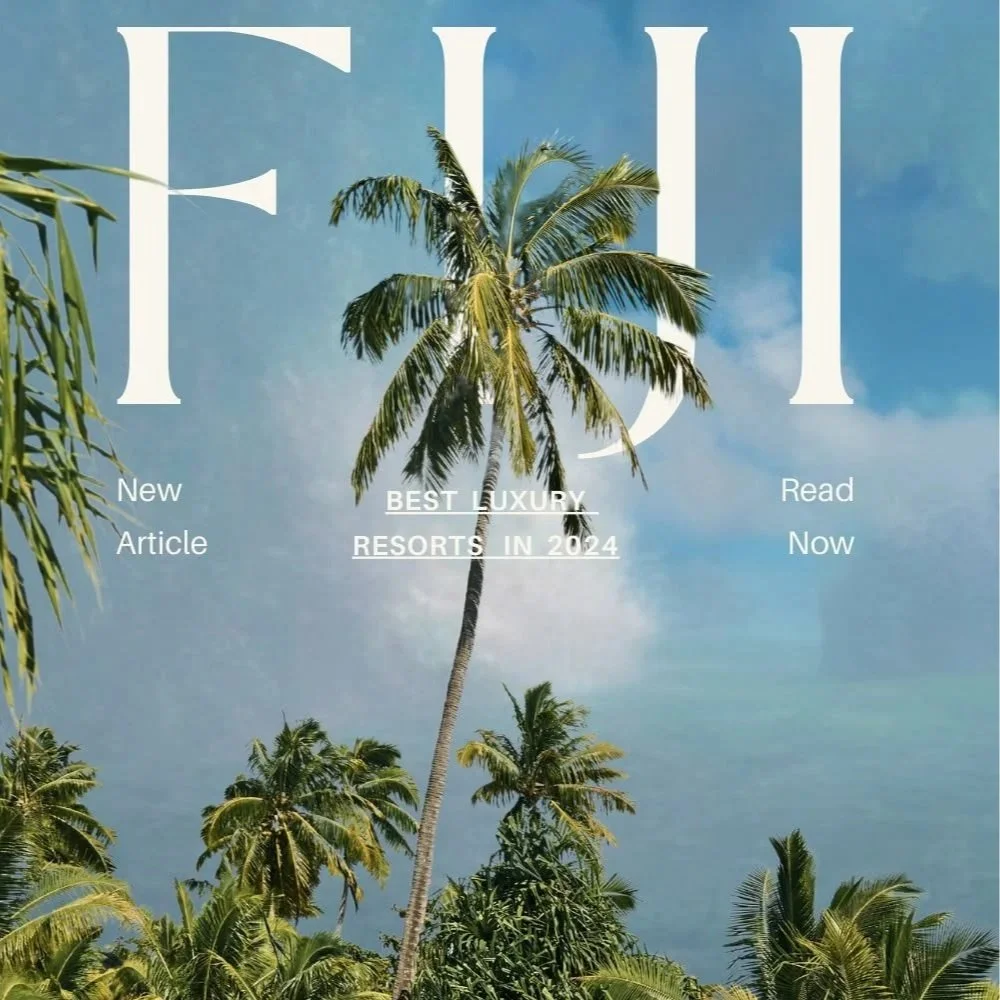
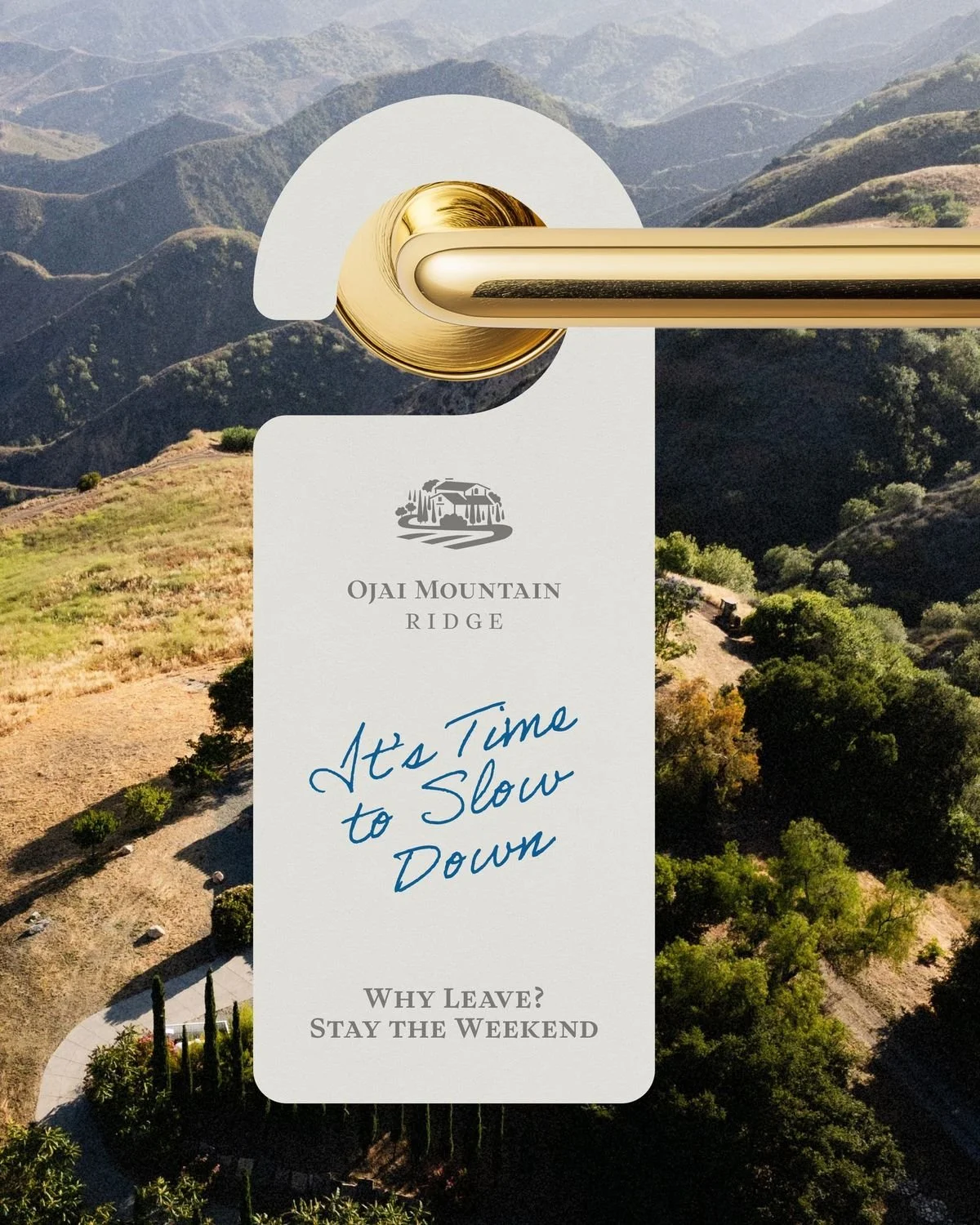
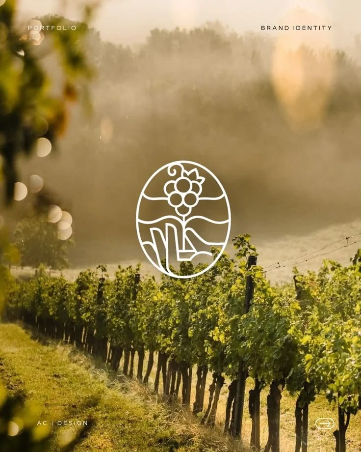
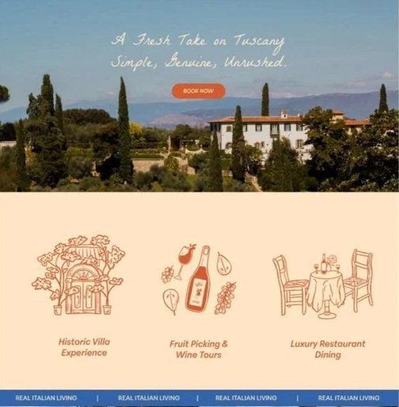
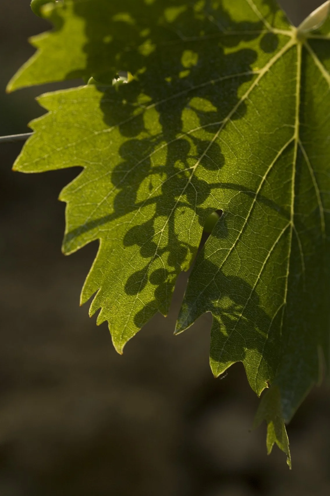
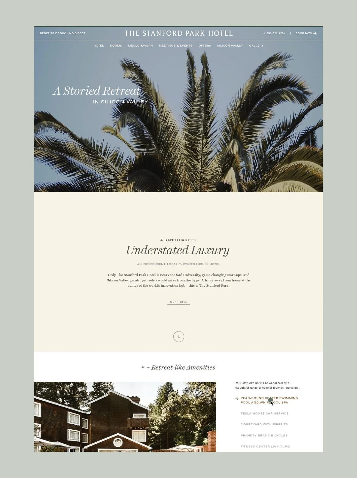
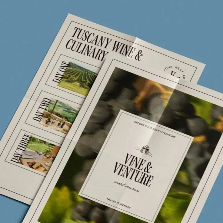
For this moodboard, I found images that aligned with preliminary color selections and font requests from the original creative brief, discovered textures through imagery that could be translated into patterns, and researched the look and feel across different applications, such as websites, social ads and printed materials.
Color Selections
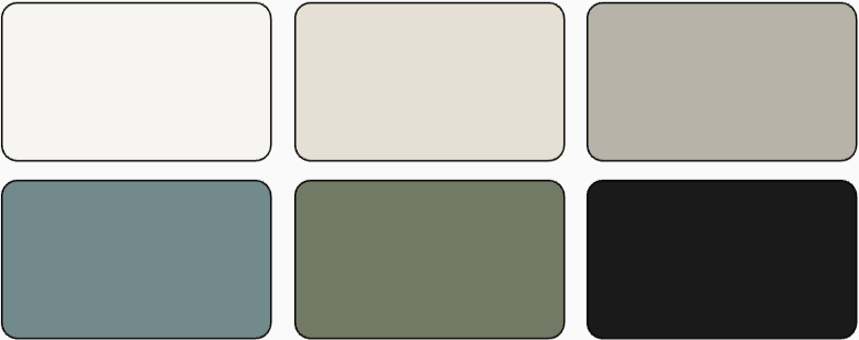
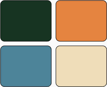
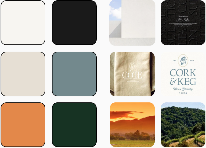
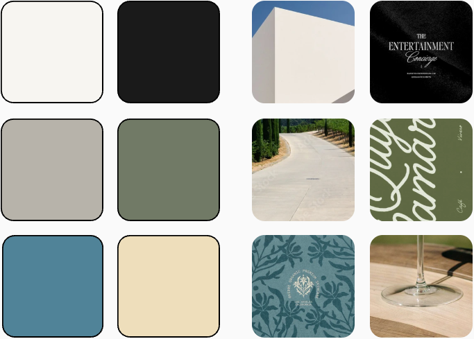
The creative brief provided six colors choices that reflected minimalism, sophistication and calm. However, the palette felt cold and more clinical, lacking the notion of forward-thinking and not reflecting the retreat to nature, especially with the event's location set in sunny California. I introduced four colors that could be swapped in to bring warmth and visual interest in the eventual design phase.
I also presented two color palette options with their own mini moodboards for each. At the conclusion of the presentation, no one was selected at the time, but the team liked both options.
Font Selections
In the brief, it was asked that primary fonts to be a clean, geometric sans-serif that exuded confidence, while the secondary font was a refined serif font. While including CRF's standard font, Gibson, as the primary, I also introduced a few alternative sans serifs and then serif options for the secondary. I had also presented handwritten fonts as I had seen across research for events in similar hospitality settings, however it was opted to not move forward with any handwritten options.
PRIMARY




SECONDARY



HANDWRITTEN




Design Elements & Patterns
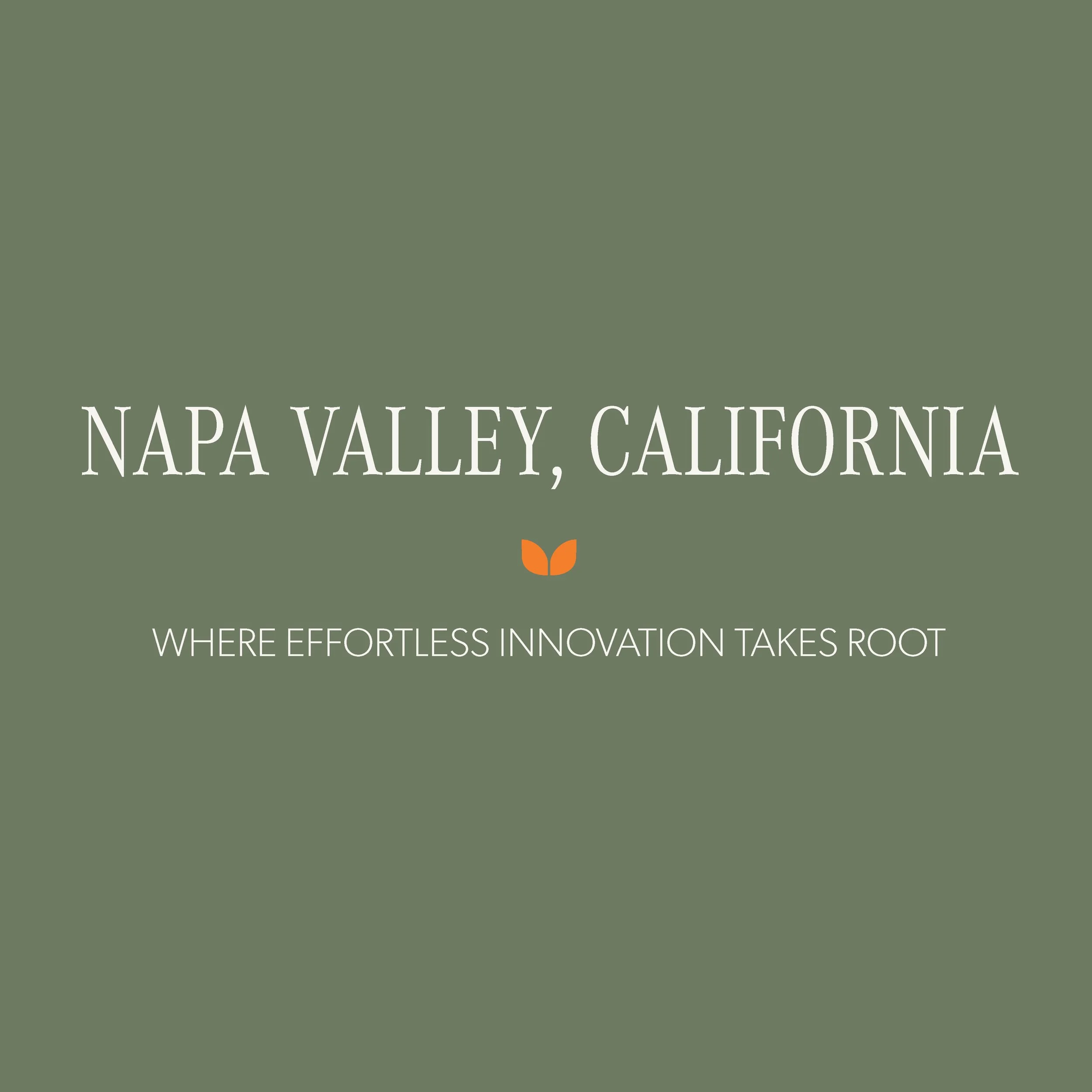
This two-leaf element and subsequent patterns are inspired by shapes in our industry partner's logo and are linked to the natural, clean and geometric essence. Within the creative brief, there was also a mentioned interest in fine lines, subtle light-inspired gradients and soft layering of elements.



Imagery Direction
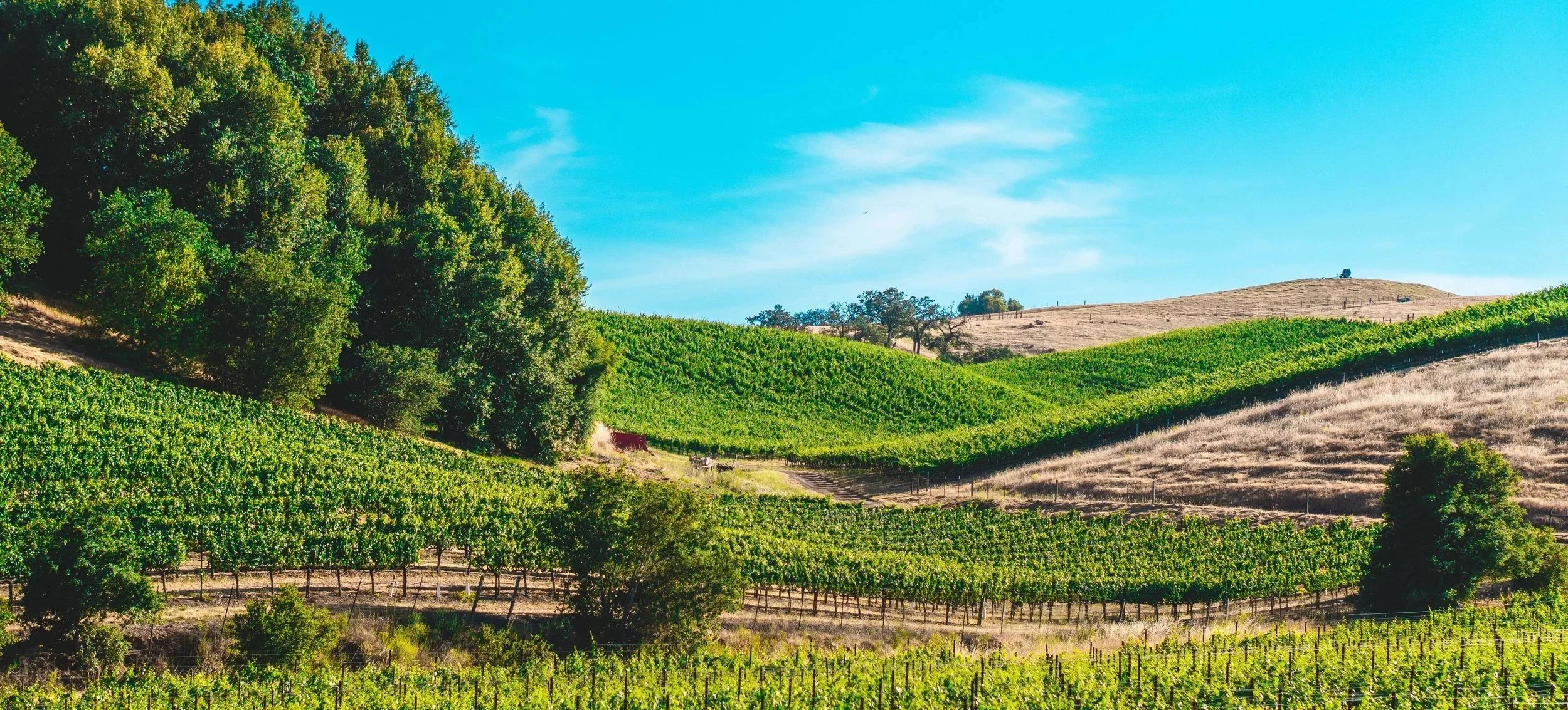
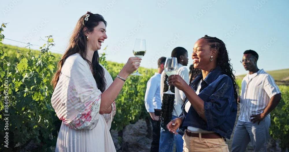
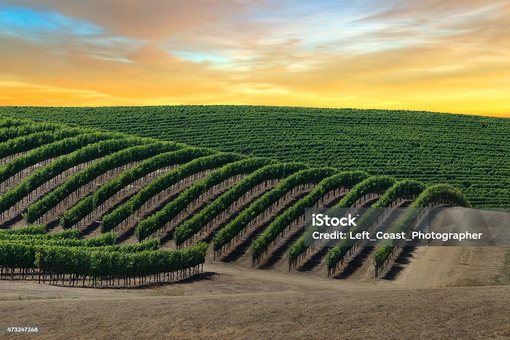
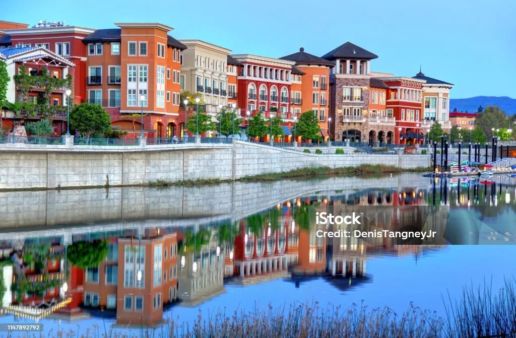
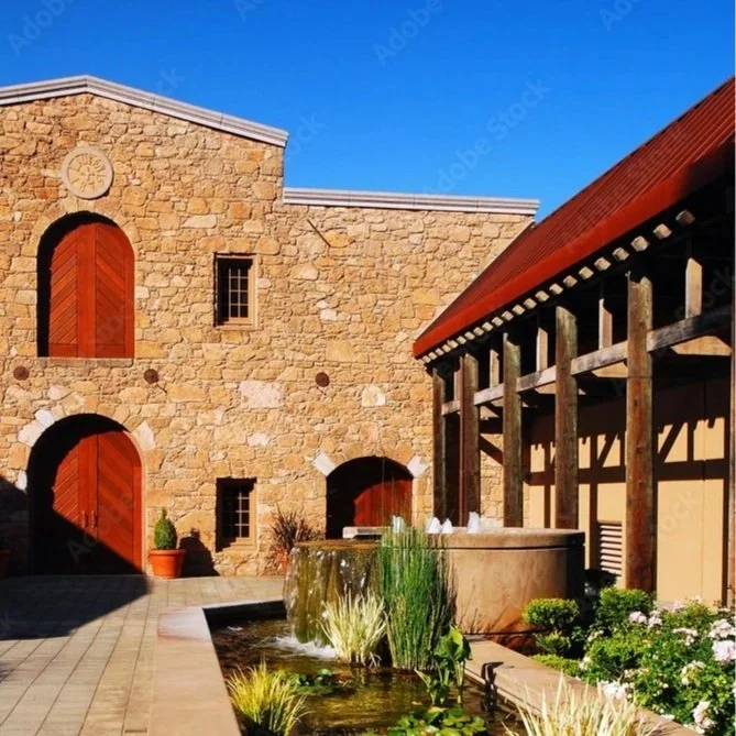
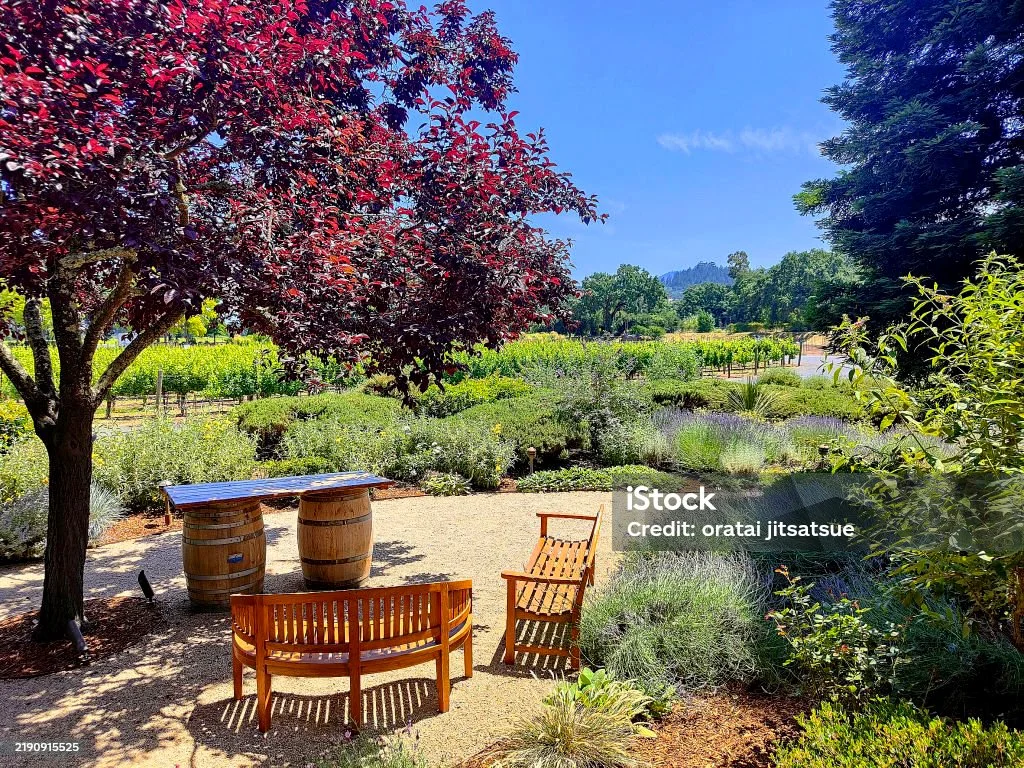
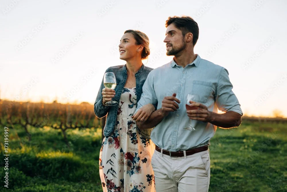
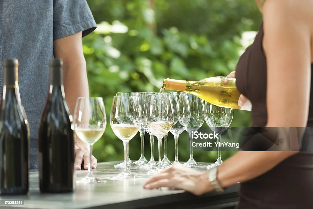
One of the most important things noted about imagery for this event was to avoid images typically used across our conference deliverables. No overly crowded shots, medical imagery and other staged images. Instead, there was a desire for images depicting thoughtful, small-group settings, people in vineyards, and clean indoor and outdoor scenes with natural lighting.


Outcome & Next Steps
Presented to the Director of Marketing, Creative Director and other members of the marketing team, it was determined that this presentation strongly reflected the creative brief. Next steps for this project will include to create a few options for base artwork, receiving preliminary copy to work on a few preview deliverables (eblast, social and webpage), and make a few edits to the presentation before sharing with upper leadership.