CRF AI Icon
Led creative development of the icon for Cardiovascular Research Foundation’s AI assistant.
❋ Project OverviewTimeline: August 2026 – September 2026
Works Done: Icon Design, Illustration, Brand Strategy
Tools: Illustrator, InDesign (for presentations)
Planning
The creative team was shared a presentation which outlined the AI assistant's purpose, name options, potential design direction, and a tentative launch timeline across app, website and social channels. The purpose of the assistant is to navigate conference agendas and build personalized, informational schedules based on attendee interest.
With its launch set for TCT, CRF's largest conference, in October 2026, it was imperative to adhere to the timeline and deliver clean iterations as soon as possible in order to implement within the app so attendees could experiment with the assistant and begin planning their persoanlized itineraries.
The icon should exude knowledge, friendliness, trust, and forward-thinking. It was also asked that the icon be able to scale and be used across all CRF events and websites.
Suggested Imagery
The creative team was given the following imagery to pull inspiration from for design.
CRF HEART

While we cannot explicitly modify the CRF heart according to brand guidelines. We can however recreate a similar heart shape without the iconic curved lines.
LINES & NODES

One team member mentioned these shapes as being prominent within AI imagery and seem tech forward.
STARS

Stars are a fairly common symbol of AI.
Lo-Fi Sketches
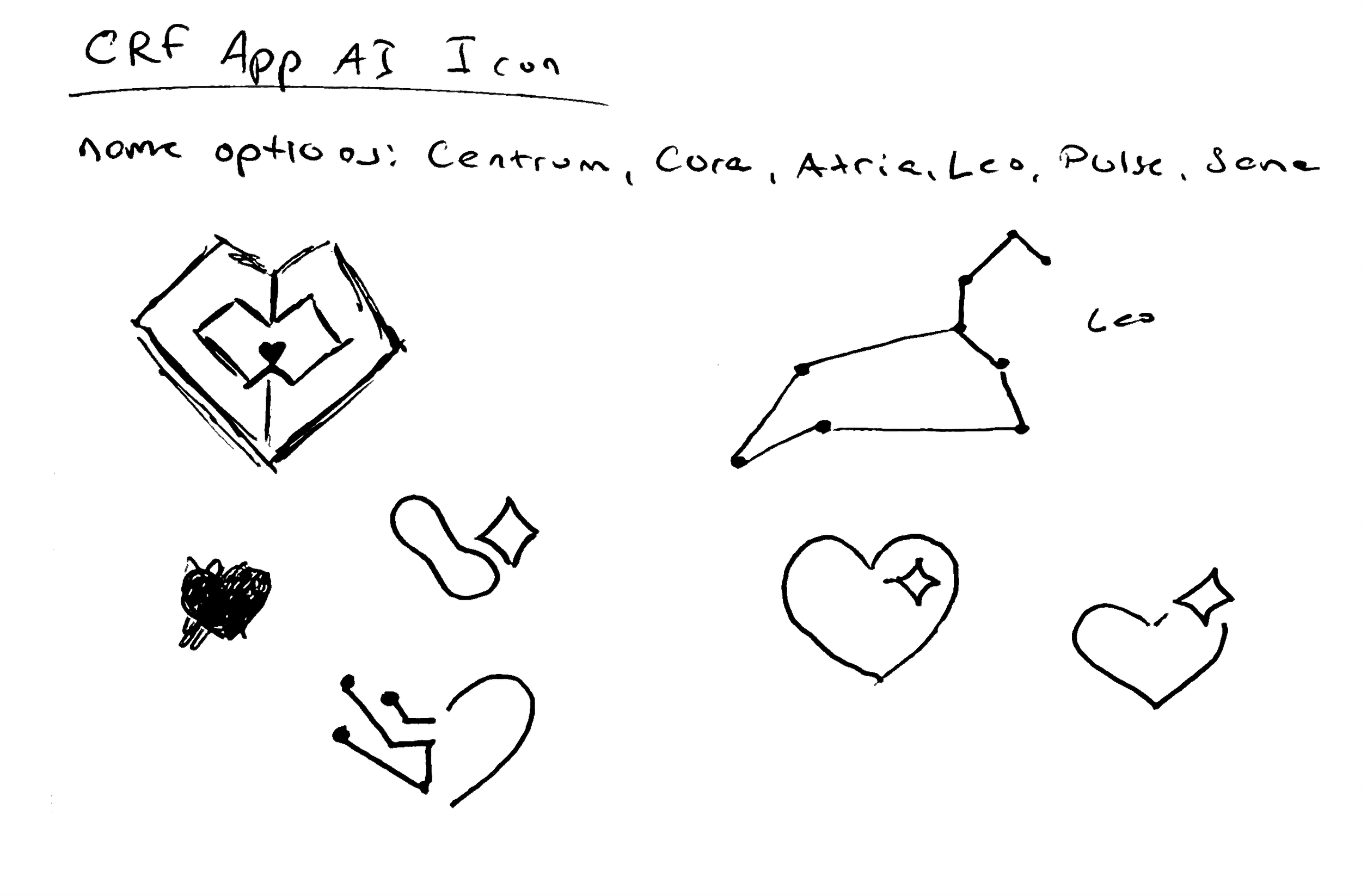
Quick napkin sketches based on name options and provided visual inspiration.


First Renderings For the “Leo” Concept
I wanted to add the nodes/stars to the constellation concept, but once I completed the line-work, I knew wasn’t going to scale well. I did see potential in the lion-heart design.


First Renderings For the “Pulse” Concept
I wanted to try shapes that were more hand-drawn and semi-abstract. It led to the second digital sketch where I combined the EKG line into the star shape.

Combined aspects from all three sources of inspiration for this iteration.
Icon Designs



These three options based on the original names were presented to leadership. It was noted that while the CRF red was used for these first designs, that the red could be swapped for conference colors as needed for website and app use.
But none of them were chosen… Why?
Leadership was still feeling a sense of disconnect between their vision for the icon and the designs that were presented. They realized from these designs that they did not like the star motif or lion-head/Leo concept. While they liked the star/pulse design, they felt the pulse itself targeted too small a niche within the overall target audience.
They felt most aligned with the line-heart design, but wanted the stars removed and wanted it to “pop” more. They also requested now that one icon be able to be used across all conferences, rather than having different color variations (which I agreed with made sense). This universality would be achieved through including multiple colors pulled from all conferences.
I brainstormed what leadership felt the current iterations were lacking. The first main aspect was color, which I now had a solution for by bringing in other conference colors together. They had also mentioned wanting the icon to be friendly and fun. But what else were these logos missing that they liked from other AI icons?
I concluded that a feeling of depth was missing. Whereas other icons have clear layers and shadows, the previous iterations were flat. If I could simulate the idea that the icon was 3D, maybe that would achieve the “pop” that leadership was seeking.
New Design

WHAT DOES THIS NEWEST ITERATION ACHIEVE?
• Maintains the technological, innovative feel using the line-and-node visuals
• Incorporates and alludes to colors pulled from conference palettes, making it more inviting and fun
• Subtle shading provides depth/3D-look
• Scales down to smaller sizes well while remaining recognizable
The Final Verdict
From the CEO himself…
“I really like this design!”
After final approval from leadership, myself alongside the creative and marketing teams are currently working on initiatives to drive anticipation the new assistant and its launch ahead of CRF’s largest conference at the end of October.
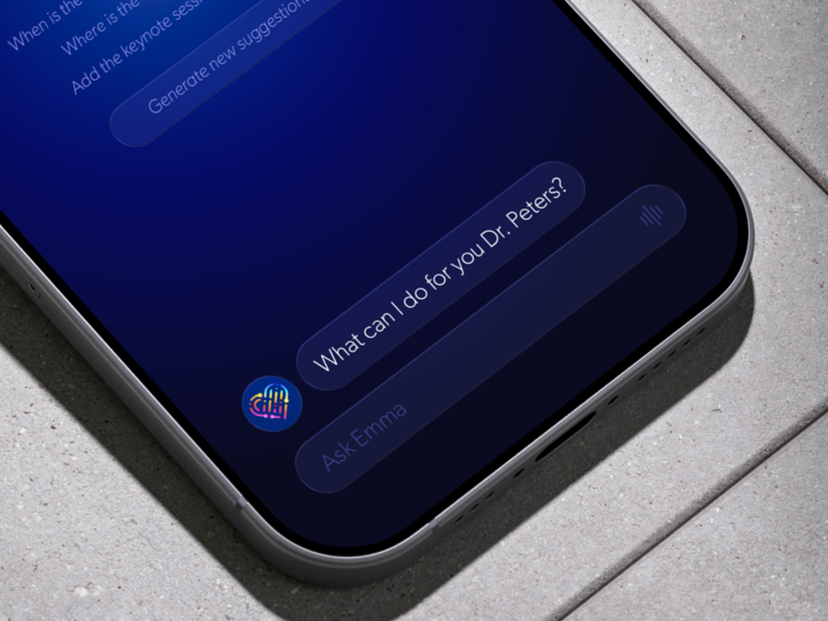
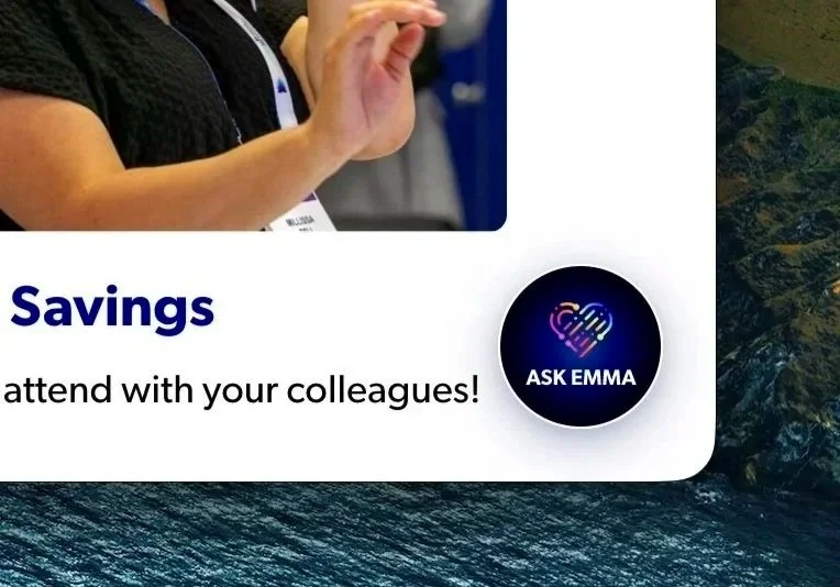
Meet Emma